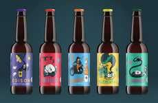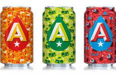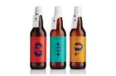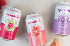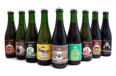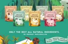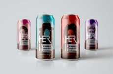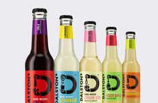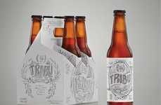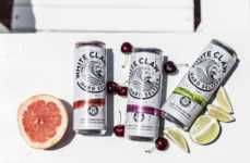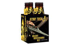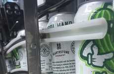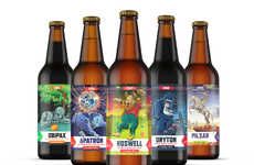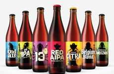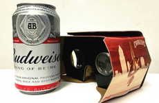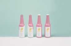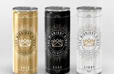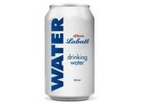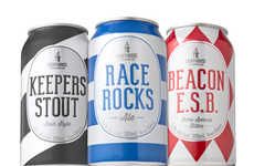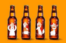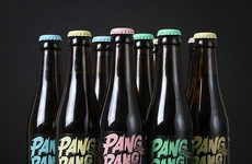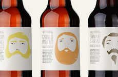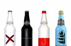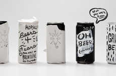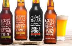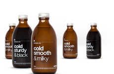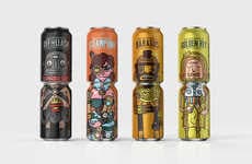


Vibrant craft beer packaging starkly contrasts with vintage-inspired aesthetics
Implications - The emergence of craft products of all kinds has led to the popularization of a subdued, artisan-inspired aesthetic when it comes to packaging. This has been especially true of craft alcohol products, leading to a divergent approach from brands, who have adopted vibrant color schemes and cartoonish designs in order to stand out.
Workshop Question - What would a more subdued version of your product or service look like? What about a more maximalist version?
Trend Themes
1. Vibrant Packaging - Craft alcohol brands are taking on vibrant color schemes and cartoonish designs to stand out from subdued artisan-inspired aesthetics.
2. Storytelling Branding - Brands are incorporating whimsical and animated characters on their beer labels, creating conversation points over social drinks.
3. Saturated Design - Craft beer packaging is using vibrant patterns and color schemes to reflect the unique flavors of seasonal beers.
Industry Implications
1. Alcohol Industry - Craft beer is pioneering more fun and vibrant alcohol packaging strategies.
2. Packaging Industry - Craft beer is inspiring more creative, vibrant, and unique packaging designs that step out from subdued, artisan-inspired aesthetics.
3. Design Industry - Craft beer is creating opportunities for graphic designers and artists to create whimsical and storytelling branding strategies for breweries.

