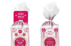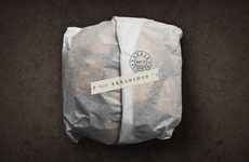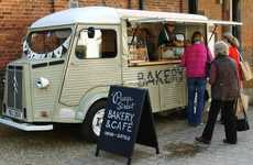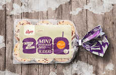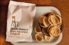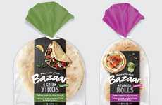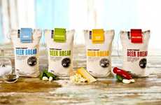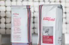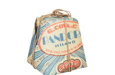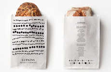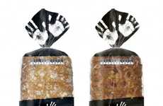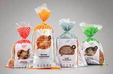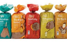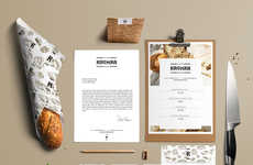
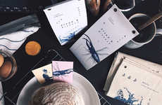
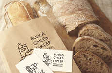
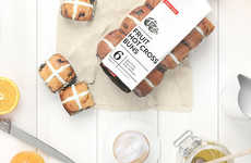
Bread branding takes on a vintage-inspired, relaxed look
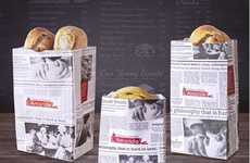
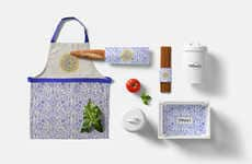
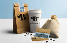
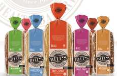
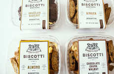
Implications - Helping bakeries have their products perceived as less processed and more independent, bread packaging is evolving to look more rustic. Using materials like paper (as opposed to plastic) and with whimsical motifs, there's a handmade feel that comes through with this approach to branding, appealing to consumers who appreciate smaller brands.
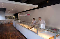
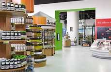
Workshop Question - Considering re-designing (or creating) a brick and mortar location for your brand, what are three things you consider 'must-haves'?
Trend Themes
1. Rustic Bread Packaging - Using materials like paper (as opposed to plastic) and with whimsical motifs, there's a handmade feel that comes through with this approach to branding.
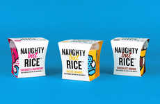
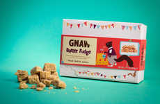
2. Playful Illustrations on Deli/ Bakery Packaging - Playful grocery illustrations and animal hybrids characters are used to promote bakery brand and convey humour and whimsy.
3. Minimalist Packaging - Brands are repositioning their packaging so that it communicates a lighter experience for audiences concerned about the percentage of carbohydrates in their diet.
Industry Implications
1. Food and Beverage - Providing artisanal quality breads, pastries, and custom cakes to a growing market of English-speaking consumers.
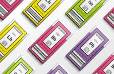
2. Graphic Design - Creating playful, engaging, and often minimalistic brand identities for bakeries and delicatessens through visual designs and packaging.
3. Sustainability - Using 100% recyclable paper in bakery branding and packaging, creating an environmentally conscious market for brands who value sustainability.
