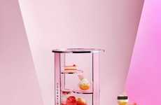

Retailers use vivid colors to give the impression of experiential design
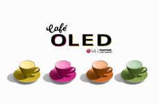
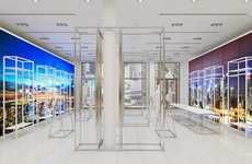
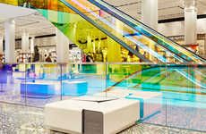
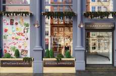
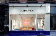
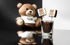
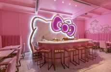
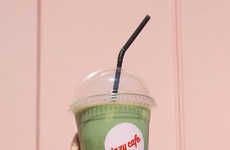
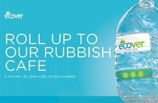
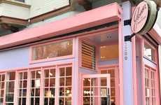
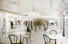
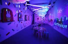
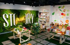
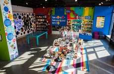
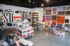
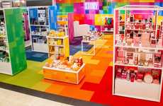
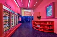
Trend - Retail and pop-up spaces are using blocked, vivid colors in order to draw consumers into their locations. The strategic use of bright colors allows brands an affordable way to give off the impression of experiential retail designs, without having to create interactive experiences in order to engage visitors.
Insight - Millennial and Gen Z consumers value brands that cater to their preferences for aesthetically pleasing retail locations. This demographic prefers locations with artistic layouts because they often makes their purchasing experience social media friendly, which can also encourage younger consumers to be less reliant on e-commerce.
Insight - Millennial and Gen Z consumers value brands that cater to their preferences for aesthetically pleasing retail locations. This demographic prefers locations with artistic layouts because they often makes their purchasing experience social media friendly, which can also encourage younger consumers to be less reliant on e-commerce.
Workshop Question - How could your brand better employ color to draw customers in?
Trend Themes
1. Experiential Design - Using vivid colors to give the impression of experiential design
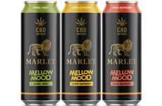
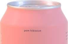
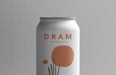
2. Cbd-infused Beverages - Beverage pop-ups offer CBD-infused sparkling water, which helps to create balance in the body and clarity in the mind
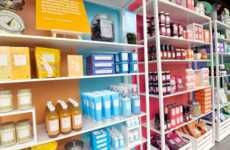
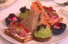
3. Color-based Settings - Using color as a curation tool to showcase products arranged by hue
Industry Implications
1. Retail Industry - Integrating experiential design and color curation to engage customers and enhance brand image
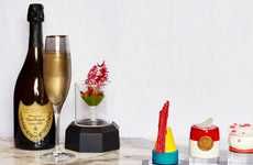
2. Food and Beverage Industry - Incorporating CBD-infused beverages as a healthier alternative and offering colorful, visually appealing products
3. Technology Industry - Designing multi-sensory experiences using digital displays and other technology to share color-centric content


