Vitis Vinifera Wine Branding Assumes the Aesthetic Elegance of China
Amelia Roblin — December 13, 2012 — Lifestyle
References: brandsession & packagingoftheworld
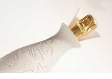
It's usually in the shape of the vessel and the graphics on the label that set one brand of vino apart from the others. In the case of Vitis Vinifera wine packaging, the familiar silhouette of the fruit-derived drink was kept but the treatment of the entire glass surface is demonstrably different.
Roberto Quiñones from the Brand Session studio teamed up with talented watercolor painter Luis Alvarez to produce a truly exquisite visual identity. A smooth and white opaque backdrop primed the canvas for a beautiful blue illustration of ornately arranged grape vines.
Vitis Vinifera wine packaging might remind the consumer of two things. The first is the grace of decorative antique tea sets and the second is of vintage pharmacy jars. The first alludes to timeless quality and the second references the chemist owners who maintain the Spanish vineyard.
Trend Themes
1. Porcelain Packaging - There is an opportunity for beverage companies to reimagine their product packaging and create a more elegant and luxurious brand image.
2. Collaborations with Artists - Working with artists like Luis Alvarez provides new opportunities for unique and visually stunning product packaging designs.
3. Vintage Aesthetic - The trend towards vintage and antique aesthetics in branding provides opportunities for businesses to create a sense of timeless quality and nostalgia in their products.
Industry Implications
1. Wine - The wine industry can take inspiration from the Vitis Vinifera packaging design and experiment with new glass treatments and illustrations on their bottles to create a more visually appealing and luxurious brand image.
2. Tea - The tea industry can incorporate elements of porcelain and vintage aesthetics in their packaging design to create a more elegant and sophisticated brand image.
3. Pharmaceuticals - Pharmaceutical companies can take inspiration from the vintage pharmacy jars that the Vitis Vinifera packaging references and experiment with adding vintage elements to their product packaging design to create a sense of nostalgia and trust in their brand.
2.4
Score
Popularity
Activity
Freshness

