The Stranger & Stranger Great King St. Design is Authoritative
Jamie Danielle Munro — June 24, 2011 — Lifestyle
References: strangerandstranger & lovelypackage
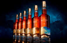
The Stranger & Stranger Great King St. package uses the Compass Box Whiskey Company's very first Glasgow office for the design. The result is an aging look that makes this whiskey look timeless and authoritative.
The design uses a variety of different typefaces, making users pay attention to the intricate detail used on the package. At the center of the label is a picture of the company's first Glasgow office, and underneath are the details for the actual Whiskey. Although there is a lot going on in this design, it does not impede the attractiveness of the label, but encourages users to pick up the bottle and actually read what it has to say. The Stranger & Stranger Great King St. whiskey packaging uses just enough detail to gain attention from consumers.
Implications - Using imagery from iconic moments in a brand's history is a powerful way to inspire an emotional connection with consumers. This inspires a sense of nostalgia amongst buyers as they are able to recognize the past behind this creation. Companies should never underestimate the power of emotional appeal when it comes to selling a product.
Trend Themes
1. Iconic Imagery - Using imagery from iconic moments in a brand's history inspires emotional connection and nostalgia, creating a sense of authenticity and familiarity.
2. Intricate Detail - Attention to intricate detail on packaging captures consumer attention and encourages engagement with product information.
3. Emotional Appeal - Emotional appeal in packaging design, such as nostalgia, can significantly influence consumer purchasing decisions.
Industry Implications
1. Whiskey - The whiskey industry can leverage iconic imagery and intricate detail in packaging design for increased consumer engagement and emotional connection.
2. Beverage - The beverage industry can utilize emotional appeal and intricate design elements to differentiate products on store shelves and attract consumer attention.
3. Design - The design industry can explore opportunities to incorporate historic imagery and attention to detail in packaging to add value and evoke emotions for brands.
0.7
Score
Popularity
Activity
Freshness

