The Heineken Icone Pure Packaging Keeps it Simple with White
Vittoria Natarelli — August 15, 2010 — Lifestyle
References: lovelypackage
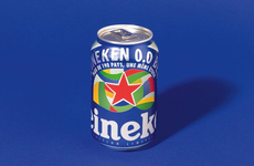
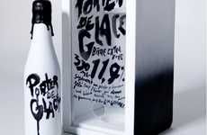
The Heineken Icone Pure packaging designed by French designer ORA-ÏTO keeps it simple, covering the bottle with a white veneer. The bottle is white with a minimal green dotted pattern, and features the iconic green logo of Heineken on the front and back. The bottle is 100% sustainable, hence the "Pure" in the title.
The Heineken Icone Pure packaging is successful in branding the bottle as "pure" and "green" while still maintaining the aesthetic of the Heineken brand.
The Heineken Icone Pure packaging is successful in branding the bottle as "pure" and "green" while still maintaining the aesthetic of the Heineken brand.
Trend Themes
1. Minimalist Packaging - Opportunity to create minimalist packaging designs that convey a sense of simplicity and sustainability.
2. Sustainable Packaging - Opportunity to develop packaging solutions that are 100% sustainable and eco-friendly.
3. Branding Through Simplicity - Opportunity to use minimalist design to effectively communicate brand values and identity.
Industry Implications
1. Beverage Packaging - Opportunity for beverage companies to explore minimalist and sustainable packaging designs.
2. Sustainable Products - Opportunity for companies in various industries to focus on developing and promoting sustainable and eco-friendly products.
3. Brand Identity - Opportunity for marketers and brand strategists to leverage simplicity and minimalist design as a means of enhancing brand identity.
5.3
Score
Popularity
Activity
Freshness


