This Heineken Beer Can Design Looks Cracked When It's Cold
Laura McQuarrie — July 8, 2014 — Lifestyle
References: heineken & packagingoftheworld
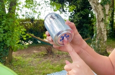
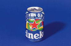
Using special ink that's only activated by the cold, this Heineken beer can has a hidden design that will let you know when your beverage has reached the perfect temperature for consumption. The beer can has a bold red Heineken star on its front, with cracked white lines around it. Although these white lines look pretty icy, it looks even cooler when the can reaches a freezing temperature, where chilled blue veins start to appear and make the can look like it is cracking open.
The cans were designed for Heineken by Raison Pure and if you stock up on these cans this summer, you'll never have an excuse to complain about drinking warm beer ever again.
The cans were designed for Heineken by Raison Pure and if you stock up on these cans this summer, you'll never have an excuse to complain about drinking warm beer ever again.
Trend Themes
1. Temperature-sensitive Packaging - Using special ink or coatings that respond to temperature changes to enhance user experience and product quality.
2. Interactive Product Design - Incorporating hidden images or features that are revealed through user interaction or environmental factors like temperature.
3. Brand Differentiation Through Packaging - Creating unique and memorable packaging designs that set a brand apart from competitors and engage consumers.
Industry Implications
1. Beverage - Innovative packaging designs that create a unique user experience or enhance the taste or quality of beverages.
2. Packaging - Developing packaging solutions that incorporate interactive features or responsive materials for enhanced user experience.
3. Marketing and Advertising - Creating brand differentiation and engaging consumer interest through unique and creative packaging designs and features.
5.9
Score
Popularity
Activity
Freshness


