The New Look for Kurko's Alcoholic Drink Cans Appeals to a New Market
Laura McQuarrie — October 6, 2014 — Lifestyle
References: trndmonitor & creativebloq
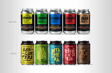
Prior to their redesign, Kurko's alcoholic drink cans were bold, blue and looked a lot like beer, appealing primarily to an all-male market. The rebranding of the drinks by Taxi Studio now presents the Long Drinks beverages as fresh and fruity. The name Kurko itself is slang for "king," and the crown is an important part of the brand's identity. Rather than reintroducing a heavy metal crown, the new beverage cans show off a crown-shaped liquid splash, which is a clever way to show that the brand has reclaimed its crown.
The new design also gives the graphic elements on the can more room to breathe and as a whole, it's now much more appealing to both male and female consumers.
The new design also gives the graphic elements on the can more room to breathe and as a whole, it's now much more appealing to both male and female consumers.
Trend Themes
1. Rebranding Alcoholic Drinks - Opportunity for alcoholic drink brands to revamp their designs and appeal to a wider demographic.
2. Fresh and Fruity Beverages - Increased demand for refreshing and fruity alcoholic beverages with eye-catching branding.
3. Clever Graphic Elements - Growing trend of using innovative and clever visual elements on packaging to enhance brand identity.
Industry Implications
1. Alcoholic Beverages - Potential for disruption and increased market share for brands in the alcoholic beverages industry through creative rebranding strategies.
2. Graphic Design - Opportunity for graphic design professionals to create visually appealing and innovative packaging designs for various industries, including alcoholic beverages.
3. Advertising and Marketing - Potential for marketing agencies to help brands in different industries attract a wider customer base through strategic rebranding initiatives.
1
Score
Popularity
Activity
Freshness

