Via XX Settembre Packaging has an Utterly Scrumptious Homespun Image
Amelia Roblin — July 25, 2012 — Lifestyle
References: studiofusentast.no & lovelypackage
In a world where you might not recognize the names of half of the ingredients in your edible goods, Via XX Settembre packaging has an enticing appeal. Looking at it, you know instantly that the products inside were put together with extra care, through judgements based on graphics and material.
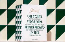
A checked pattern covers every single bag, box and carton with little squares of blue, green and white that reference the company's Genoese seaside location. Dyed in fabric, the wrappers of the rice and bread sticks and the label on the jar of polenta almost look like they've been cut out of the corners of a soft picnic blanket. The name of the brand on Via XX Settembre packaging was printed by Studio Fusentast to give the added appearance of heritage and sophistication.
A checked pattern covers every single bag, box and carton with little squares of blue, green and white that reference the company's Genoese seaside location. Dyed in fabric, the wrappers of the rice and bread sticks and the label on the jar of polenta almost look like they've been cut out of the corners of a soft picnic blanket. The name of the brand on Via XX Settembre packaging was printed by Studio Fusentast to give the added appearance of heritage and sophistication.
Trend Themes
1. Homespun Packaging - Opportunity for brands to differentiate themselves by using fabric-inspired packaging designs that convey a sense of traditional craftsmanship and care.
2. Locally-inspired Design - Designers can develop packaging that incorporates elements of a brand's locale, creating a sense of authenticity and uniqueness that appeals to consumers.
3. Heritage Branding - Brands can use typography and design techniques that convey a sense of tradition and long-standing heritage to create a perceived value that resonates with consumers.
Industry Implications
1. Food and Beverage - Opportunity for food and beverage brands to use homestyle packaging designs that emphasize quality and authenticity, particularly for artisanal or specialty products.
2. Gift and Specialty Items - Designers can use homestyle packaging designs for gift and specialty items to convey a sense of mom-and-pop stores and traditional family businesses.
3. Crafts and DIY - Homestyle packaging designs can be used for crafts and DIY kits to create a sense of handcrafted tradition and care, appealing to consumers who value authentic, artisanal products.
3.6
Score
Popularity
Activity
Freshness


