The Ticino Chocolates Wrapper is as Minimalistic as the Product
Susan Keefe — January 6, 2012 — Lifestyle
References: thedieline
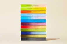
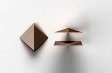
Design student Malcolm Allan Simmons created this sweet, but simple wrapper for a fictional Swiss chocolate company Ticino Chocolates. Simmons focused on designing minimalist color-coded wrappers that clearly advertise the bar of chocolate that lies beneath. Each wrapper sports a geometric design rendered in varying shades of the dominate color.
Playing with slight variations in aesthetics, Simmons' design work is reminiscent of the work of abstract artist Mark Rothko, who successfully conveyed emotion through simplistic geometric shapes and soft variations in shades. The simple wrapper presents Ticino Chocolates company as transparent as the short ingredients list on the back of the package; the lack of flourish on this fetching package proves that this brand has nothing to hide. Devoid of loud copy and tag lines, the Ticino Chocolates packaging lazily seduces you rather than twists your arm.
Sweet, subtle and soft, the Ticino Chocolates wrapper is a prime example of minimalist packaging done well.
Trend Themes
1. Minimalist Packaging - The simple and color-coded geometric design trend in packaging showcases a transparent and minimalist approach to branding.
2. Geometric Design - The use of geometric shapes and variations in shades in packaging design creates a visually appealing and engaging experience for consumers.
3. Simplistic Aesthetics - The trend of using soft and subtle design elements in packaging appeals to consumers looking for a calming and minimalist experience.
Industry Implications
1. Food and Beverage - The minimalist packaging trend presents an opportunity for food and beverage companies to differentiate their products and create a more visually appealing brand image.
2. Graphic Design - The use of geometric design and minimalist aesthetics in packaging design opens up possibilities for graphic designers to create unique and eye-catching packaging solutions.
3. Consumer Goods - The trend towards minimalistic packaging design provides an opportunity for consumer goods companies to enhance their product packaging and stand out in the market.
4.4
Score
Popularity
Activity
Freshness

