Old River Ale Looks More Like a Liqueur
Jamie Danielle Munro — June 3, 2014 — Lifestyle
References: behance.net & packageinspiration
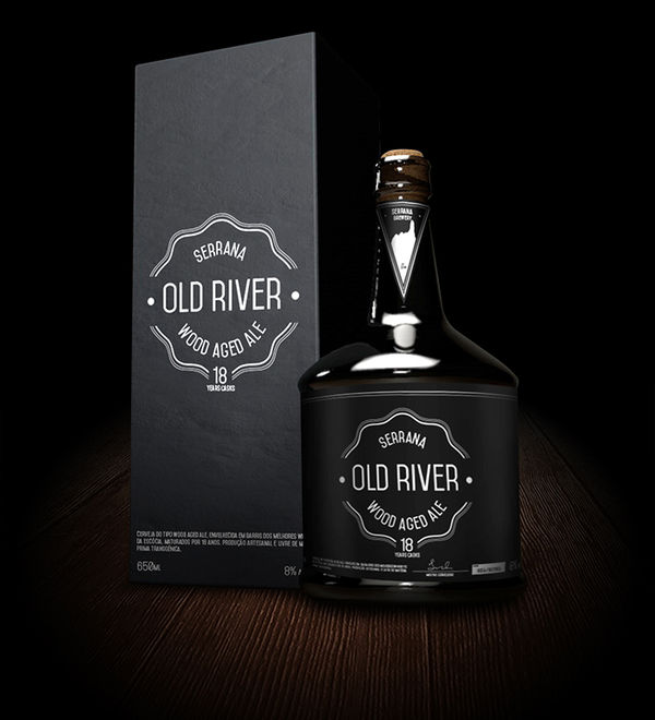
Old River Ale is a concept completed by Bruno Reis for an assignment, in which the team had to come up with an idea for a craft beer. The result is a branding design that looks more like an upscale bottle of port than an ale. However, this is exactly the point, as the goal would be to attract a more wealthy and upper class clientele.
The bottle takes on a very dark aesthetic, coming in a black box with silver font, and the glass is a darker color too. The dark branding makes it more geared towards a male demographic, and again the shape of the bottle would suggest that the brand is targeting men with money.
The bottle takes on a very dark aesthetic, coming in a black box with silver font, and the glass is a darker color too. The dark branding makes it more geared towards a male demographic, and again the shape of the bottle would suggest that the brand is targeting men with money.
Trend Themes
1. Luxury Beer Branding - Creating craft beer branding that incorporates luxury elements to attract a wealthier clientele.
2. Upscale Packaging Design - Developing packaging designs for craft beer that resemble high-end alcoholic beverages like liqueur or port.
3. Targeted Demographic Branding - Designing craft beer branding that specifically targets affluent male consumers.
Industry Implications
1. Craft Beer - Craft beer breweries can explore luxury branding to expand their customer base and attract a higher-income clientele.
2. Packaging Design - Packaging design agencies can offer specialized services for craft beer brands looking to create upscale packaging designs.
3. Alcoholic Beverage Marketing - Marketing agencies can develop targeted campaigns to promote craft beer brands that focus on the wealthy male demographic.
2.3
Score
Popularity
Activity
Freshness

