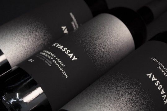
Kvassay Vino Uses Simplistic Black and White Color Schemes
Jamie Danielle Munro — April 26, 2014 — Lifestyle
References: behance.net & lovelypackage
Kvassay vino has gone with an extremely minimalist look for its latest wine packaging, designed by Eszter Misztarka of Hungary.
The brand uses a straightforward black and white scheme, with the box that the wine comes in being all one color except for a small white symbol. Psychologically, black represents a sense of sophistication and elegance, which is exactly what this wine exudes. Instead of overwhelming buyers with an extreme burst of color, Eszter Misztarka does the opposite, giving the vino a mysterious effect.
Apparently the symbol used on the front of the packaging is the "Omega-sign, commonly known as the symbol of the beginning and end of all things." This symbolism combined with the minimalist feel puts this wine branding a cut above the rest when it comes to packaging.
Trend Themes
1. Extreme Minimalism - Opportunity for companies to simplify their design and showcase their product in a mysterious, sophisticated manner.
2. Black and White Branding - Opportunity for companies to establish a sense of elegance and sophistication through color palette choices in branding efforts.
3. Symbolic Design - Opportunity for companies to incorporate symbolic elements in designs to elevate their brand and create an aura of depth and meaning.
Industry Implications
1. Wine and Spirits - Wine and spirits brands could benefit from minimalist, elegant packaging designs that can differentiate them from competitors.
2. Consumer Packaged Goods - Companies in the consumer packaged goods industry could benefit from simplifying their packaging design to create a luxurious, sophisticated aesthetic.
3. Creative Design - Design agencies could benefit from offering minimalistic design options to clients to create sleek and modern brands.
5.3
Score
Popularity
Activity
Freshness


