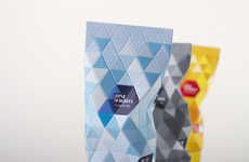
The New Ikea Food Packaging is Minimal and Literal
Vivian Lau — June 27, 2012 — Marketing
References: ikea & fastcodesign
With no additional slogans, health notes or 'new and improved' tags cluttering the face of the new Ikea food packaging, the concept breaks all the conventional branding rules.
The appeal of a super minimalistic look is certainly effective as the packaging is impossibly aesthetically drawing. Featuring only the most basic of wording, the names given to its products are not at all flourishing or pretty. Pasta is simply 'Pasta,' with no embellishment, and chocolate remains the same as well. Other products may have an accompanying illustration, but it is never intrusive in position or design. The color scheme is streamlined to be plain, only occasionally popping with bright hues.
This new branding initiative is in line with the overarching theme of Ikea -- to have the most simple-to-use and clean looking furniture possible. Extending the same courtesy to its food, the design mogul seems to do everything right.
Trend Themes
1. Minimalist Packagaing - Companies across industries can consider adopting minimalistic packaging that highlights only essential information for a cleaner and visually appealing look.
2. Literal Product Naming - The trend of using simple and to-the-point names for products, without any added embellishments or slogans, is gaining popularity among businesses.
3. Streamlined Branding - Brands can benefit from a streamlined approach to branding that helps convey their values and offerings in a clear and concise manner.
Industry Implications
1. Food and Beverage - Food and beverage companies can explore the trend of minimalist packaging and literal product naming to stand out on the shelves and convey product purity.
2. Furniture - The trend of streamlined branding and minimalistic design can be extended to industries outside of food, such as furniture, to create a cohesive and visually pleasing brand image.
3. Personal Care - Personal care brands can adopt the trend of minimalist packaging and literal product naming to create a sense of purity and simplicity for their products.
4.5
Score
Popularity
Activity
Freshness


