The Dulux Color of the Year Celebrates the Optimism Felt Post-Pandemic
Francesca Mercurio — October 19, 2021 — Art & Design
References: dezeen
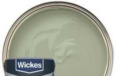
The paint brand Dulux announced its Color of the Year for 2022, and taking home the prize is the Bright Skies blue shade.
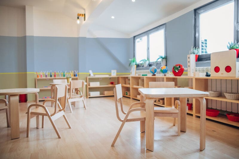
The Bright Skies shade is light and airy with a subtle blue hue. It is described as perfectly capturing the optimism felt by society following numerous months of quarantine. Marianne Shillingford, creative director at Dulux UK, views Bright Skies as evoking the "shared experience of feeling trapped inside and a growing concern for the future of our beautiful yet fragile planet."
Society wants to feel refreshed, revitalized, and joyful, and Bright Skies helps create an atmosphere that imbues just those emotions. The pastel tone of Bright Skies lends a rather versatile aesthetic that can complete any space - from a nursery, outdoor facade, public space, private space, etc.
Image Credit: Dezeen
Trend Themes
1. Versatile Pastel Tones - The versatility of pastel shades provides opportunities for businesses to offer a wide range of color options for various spaces.
2. Emotional Connection Colors - Colors that evoke specific emotions, such as the optimisim of Bright Skies, can be used by businesses to create unique customer experiences.
3. Sustainability-inspired Hues - Colors inspired by sustainability trends can be used to show a business' commitment to environmentally conscious practices.
Industry Implications
1. Interior Design - The use of versatile pastel tones, emotional connection colors, and sustainability-inspired hues in interior design can showcase a business' ability to create a unique and sustainable space.
2. Architecture - Architectural firms can incorporate versatile pastel tones, emotional connection colors, and sustainability-inspired hues in their designs to create visually appealing and sustainable buildings.
3. Home Improvement Retail - Home improvement retailers can capitalize on the trend of versatile pastel tones, emotional connection colors, and sustainability-inspired hues by offering a variety of color options and showcasing eco-friendly paint products.
1.4
Score
Popularity
Activity
Freshness

