Covergirl's Rebranded Products Boast Black and White Packaging
Laura McQuarrie — February 28, 2018 — Art & Design
References: covergirl & thedieline
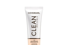
Popular cosmetics brand Covergirl recently refreshed the design of its product packaging to reflect a more minimalist aesthetic.
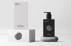
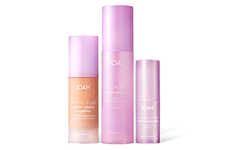
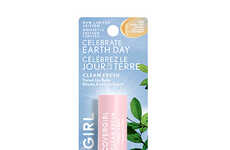
While the previous packaging designs embraced many shapes and colors, the new designs adopt a simple system of black and white graphics, mainly made up of linear elements. Although color is not a dominant element of the packaging itself in most cases, this only serves to make the uniquely hued products stand out all the more.
New York-based agency Established led the redesign project, introducing "the biggest change to Covergirl in its history." As the beauty section of a store can be difficult to navigate, the refreshed drugstore makeup packaging has been designed to offer an understated look that will still catch the eyes of consumers with its clean, confident style.
Trend Themes
1. Minimalist Packaging Design - Opportunity for other beauty brands to adopt a minimalist design approach to stand out in a crowded market.
2. Simplifying Product Presentation - Opportunity to streamline product packaging to make it more visually appealing and easier for consumers to navigate.
3. Bold Color Accents - Opportunity for innovative brands to use bold color accents on minimalist packaging to create a visually striking contrast.
Industry Implications
1. Beauty and Cosmetics - Opportunity for brands in the beauty and cosmetics industry to rebrand their products with minimalist packaging designs.
2. Package Design - Opportunity for package design agencies to assist brands in the beauty industry to refresh and modernize their product packaging.
3. Retail and Consumer Goods - Opportunity for retailers to showcase minimalist drugstore cosmetics as a trendy and visually appealing option for consumers.
5.6
Score
Popularity
Activity
Freshness

