'Don't Hide It. Period.' Starts Conversations on Feminine Care
Laura McQuarrie — March 22, 2018 — Lifestyle
References: donthideitperiod & packagingoftheworld
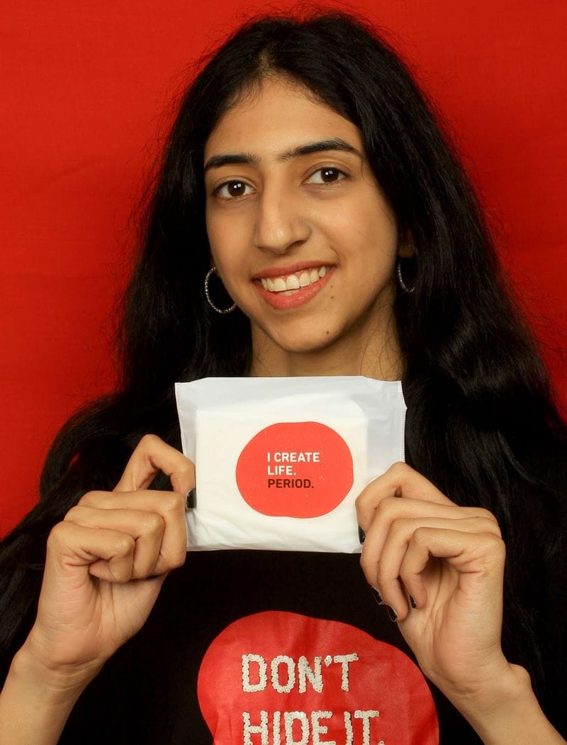
India's 'Don't Hide It. Period.' is on a mission to generate a conversation around menstruation and "turn the boring sanitary pad packaging into one that is inspiring." As such, its period care products are packaged with an unmissable color scheme and messaging that's equally as bold. Some of the conversation-starting phrases that can be found on the sanitary pad packages includes "I Create Life. Period" and "Basic Biology. Period."
To clearly distinguish itself from other menstrual product producers, Don't Hide It. Period. uses a red color scheme to present all of its products. The color red is rarely used in feminine care product packaging and branding—with the majority of commercials featuring only a mysterious blue liquid to represent a substance that is present in every human body.
The youthful brand is largely supported by consumers in the 18 to 24 age bracket, with many sharing pictures of the pads on social media using the #donthideitperiod hashtag.
As well as empowering young women, the brand supports women in rural areas by providing access to low-cost, biodegradable sanitary napkins through The Better India with each pack of pads that is purchased.
Trend Themes
1. Conversation-starting Packaging - The trend of using bold and inspiring messaging on sanitary pad packaging presents an opportunity for brands to engage in conversations around menstruation.
2. Colorful Branding in Feminine Care - The trend of using vibrant colors, such as red, in feminine care product packaging disrupts the traditional blue color scheme and creates differentiation in the market.
3. Social Media Support and Advocacy - The trend of consumers sharing pictures and stories of menstrual products on social media to support and advocate for brands like 'Don't Hide It. Period.' provides opportunities for increased brand visibility and engagement.
Industry Implications
1. Feminine Care Products - Brands in the feminine care industry can embrace the conversation-starting packaging trend to empower women and create a unique brand identity.
2. Packaging and Branding - The packaging and branding industry can capitalize on the trend of using vibrant and bold colors in sanitary pad packaging to help feminine care brands differentiate themselves and spark conversations.
3. Social Media Marketing - The social media marketing industry can take advantage of the trend of consumers sharing pictures and stories of menstrual products to create impactful campaigns and support brands in advocating for menstruation.
2.8
Score
Popularity
Activity
Freshness
