Visually's BMI Chart Calculator Compares Weights Across the World
Kyle Towers — March 31, 2013 — Lifestyle
References: visual.ly
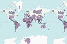
This BMI chart calculator and comparison infographic by Visually will let you know how you're doing worldwide. Unfortunately, according to this chart, America is in pretty rough shape. The chart has listed them as having the second highest BMI average.
The chart is broken down into four different sections of BMI averages. It starts by listing countries with averages between 20-22.9 and reaches the average of 27 plus. It is stated in the chart that those with a BMI of 18.5-22.9 are in a healthy range.
At the bottom of the BMI chart there is a place that allows one to calculate their own results. This can give you an idea of how you compare against the worldwide statistics and even just the statistics within your specific country.
Trend Themes
1. BMI Chart Calculator - Developing innovative BMI chart calculators that provide accurate weight comparisons across different populations.
2. Comparison Infographic - Creating visually appealing infographics that compare weight statistics globally and raise awareness about health issues.
3. Personalized Statistics - Designing tools that allow individuals to calculate and compare their own BMI results against global and national averages.
Industry Implications
1. Health Tech - Health tech companies can develop advanced BMI calculator apps and wearable devices to track weight and provide personalized health insights.
2. Wellness Tourism - Wellness tourism industry can leverage the BMI chart calculator to promote health retreats and destination resorts focused on weight management and healthy living.
3. Global Health Awareness - Organizations dedicated to raising awareness about global health issues can use comparison infographics to educate and advocate for healthier lifestyles worldwide.
6
Score
Popularity
Activity
Freshness


