The Tim Walker O'2nd Campaign is Dainty and Demure
Renee Ramsarran — February 19, 2011 — Marketing
References: o2nd.cn & fashiongonerogue
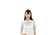
The Tim Walker O'2nd campaign features models Sigrid Agren, Julija Steponaviciute and Molly Smith. The ladies look dainty and demure, surrounded by oversized props. The exceedingly large white flowers, wheel barrow and pretty pink glove were brought in by set designer Simon Costin. These amazing props make the girls look like precious tiny dolls playing dress-up throughout the series.
The mostly white Tim Walker O'2nd campaign showcases the flirty and feminine wardrobe styled by Kate Phelan.
The mostly white Tim Walker O'2nd campaign showcases the flirty and feminine wardrobe styled by Kate Phelan.
Trend Themes
1. Oversized Props - Opportunity for companies to create unique and attention-grabbing marketing campaigns using oversized props.
2. Dainty and Demure Aesthetic - Potential for fashion brands to embrace a dainty and demure aesthetic in their advertising and product designs.
3. Creative Set Design - Demand for skilled and imaginative set designers to create captivating visual experiences for campaigns and events.
Industry Implications
1. Fashion - Fashion brands can incorporate oversized props and a dainty aesthetic into their designs and marketing strategies.
2. Advertising - Opportunity for unique and visually stunning advertising campaigns using oversized props and creative set design.
3. Event Planning - Event planners can use oversized props and creative set designs to create immersive and memorable experiences for attendees.
5.4
Score
Popularity
Activity
Freshness


