'The World as 100 People' Chart Gives a Snapshot of Human Life
Michael Hemsworth — May 1, 2013 — Lifestyle
References: jackhagley & enpundit
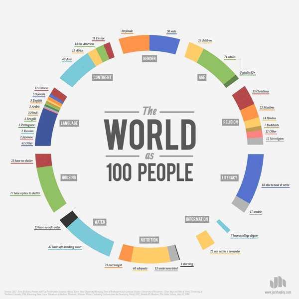
The population on Earth continues to go higher with every passing year and 'The World as 100 People' infographic helps to put the various characteristics about human life on our little planet into perspective. The infographic works by scaling the billions of people down to a simplistic 100 in order to offer tangeable statistics we can understand.
'The World as 100 People' infographic is strikingly interesting with a number of useful facts that aren't readily available unless research is proceeded. Some of the findings conclude that while 87 people have clean water to drink, 13 do not, and that while 21 people are overweight, 1 is starving.
Although 'The World as 100 People' infographic is rather simplistic, it helps us to better understand some of the startling facts about our way of life and where we require change.
Trend Themes
1. Scaled-down Infographics - Using scaled-down infographics to provide tangible statistics about human life offers disruptive innovation potential in data visualization.
2. Perspective-based Data Visualization - Perspective-based data visualization can be a disruptive innovation opportunity in providing insight into global issues in a relatable and simplified way.
3. End-user Data Visualization - End-user data visualization that provides access to valuable insights into societal issues such as access to clean water can be a disruptive innovation tool.
Industry Implications
1. Data Visualization - The data visualization industry can make use of the concept of scaled-down infographics to provide a more relatable and meaningful way to present data.
2. Market Research - Market research companies can use perspective-based data visualization to provide insights into global issues in an easy to understand format.
3. Non-profit Organizations - Non-profit organizations can use end-user data visualization to present their work and achievements in a way that resonates with their donors and provides valuable insights.
5.3
Score
Popularity
Activity
Freshness


