This Simple Coffee Branding Identity is Simple Yet Striking
Farida Helmy — June 23, 2014 — Marketing
References: liftcreative.ru & thedieline
Those who love good coffee are bound to be appreciative of good design aesthetics as well, so if you want your new java label to do well then the only way to do it is to go for a tasteful and simple coffee branding identity that will make it just as enjoyable to see the product as it is to taste it.
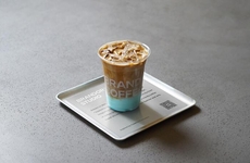
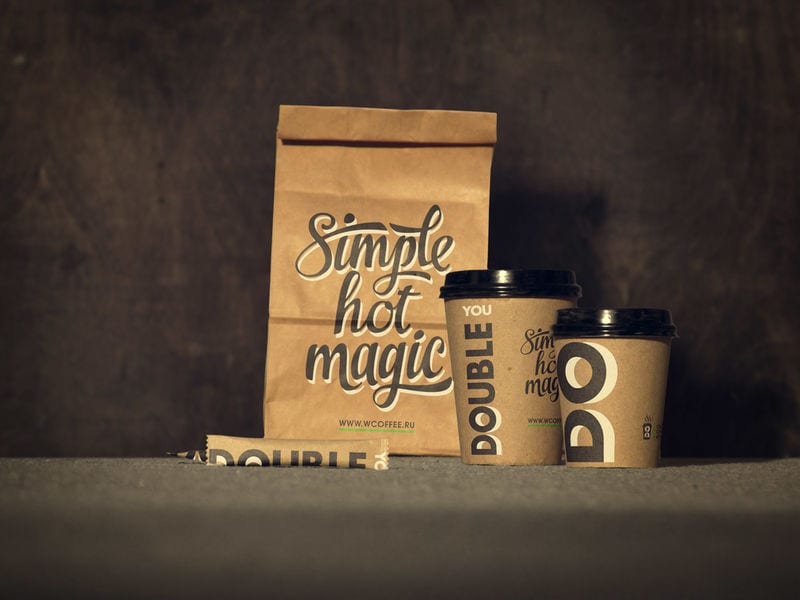
The simple coffee branding used for new coffee-to-go company DOUBLE U COFFEE is the perfect example. Designed and branded by LIFT Creative, the DOUBLE U COFFEE visual identify sticks to a warm color palette close to that of the coffee beans themselves and chose to go with a bold typeface to enhance the logo.
The simple coffee branding used for new coffee-to-go company DOUBLE U COFFEE is the perfect example. Designed and branded by LIFT Creative, the DOUBLE U COFFEE visual identify sticks to a warm color palette close to that of the coffee beans themselves and chose to go with a bold typeface to enhance the logo.
Trend Themes
1. Simple Coffee Branding - Creating a minimalistic and visually appealing coffee branding identity that resonates with consumers.
2. Warm Color Palette - Using warm colors in coffee branding to evoke a sense of coziness and highlight the natural colors of coffee beans.
3. Bold Typeface - Using a bold and eye-catching typeface in coffee branding to make the logo stand out and leave a lasting impression.
Industry Implications
1. Coffee-to-go - Creating a simple and tasteful coffee branding identity for coffee-to-go companies to attract and engage customers.
2. Design and Branding - Providing design and branding services to coffee companies, helping them create visually appealing and memorable coffee branding identities.
3. Coffee Retail - Applying a simple and striking coffee branding identity to coffee retail packaging and merchandise to enhance brand recognition and customer appeal.
3.9
Score
Popularity
Activity
Freshness
