The Perks and Mini Spring/Summer 2010 Good/Bad Collection
Allison Love — July 30, 2010 — Fashion
References: perksandmini & lifelounge
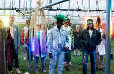
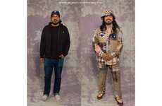
The Perks and Mini Spring/Summer 2010 collection features an interesting and creative approach to clothes. The lookbook features split-screen images, many featuring nature or random images on one side.
The collection is called Good/Bad; assuming it refers to the split screen images, I suppose you must decide which side is good and which side is bad. The Perks and Mini Spring/Summer 2010 collection seems like it's a bit old school, but is creative and interesting nonetheless.
The collection is called Good/Bad; assuming it refers to the split screen images, I suppose you must decide which side is good and which side is bad. The Perks and Mini Spring/Summer 2010 collection seems like it's a bit old school, but is creative and interesting nonetheless.
Trend Themes
1. Split-screen Imagery - Opportunities for utilizing split-screen imagery in advertising and digital content creation.
2. Creative Lookbooks - Potential to create unique and visually captivating lookbooks to showcase fashion collections.
3. Nature-inspired Aesthetics - Incorporating nature imagery into marketing campaigns and product visuals for a fresh and organic appeal.
Industry Implications
1. Fashion/apparel - Opportunities for fashion brands to experiment with innovative lookbooks and storytelling techniques.
2. Advertising/marketing - Potential for advertising and marketing agencies to use split-screen imagery and nature-inspired aesthetics for client campaigns.
3. Digital Content Creation - Opportunities to explore split-screen techniques and nature-inspired visuals in digital content production for various industries.
3.5
Score
Popularity
Activity
Freshness

