MoonCook is a Conceptual Branding Project for Wine
Jamie Danielle Munro — July 12, 2014 — Lifestyle
References: behance.net & packageinspiration
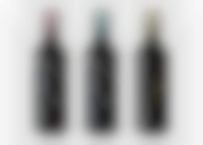
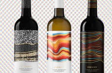
MoonCook is a student project by Melissa Agatielli, who used the lunar movements as a source of inspiration. According to the designer, "the matte black bottle is clearly reminiscent of night time and while the pop colors may not seem suggestive of the night sky, they our actually a soft yet vibrant representation of the stunning spectrum of cosmic colors found deep within our universe."
Indeed, the black bottle allows for the font and illustrations to stand out that much more. The O's on the bottle have been half-completed to look like a slice of the moon on the bottle. The colors on the top of the design help to give it that extra pop of color. For a student project, Agatielli did a great job with MoonCook.
Indeed, the black bottle allows for the font and illustrations to stand out that much more. The O's on the bottle have been half-completed to look like a slice of the moon on the bottle. The colors on the top of the design help to give it that extra pop of color. For a student project, Agatielli did a great job with MoonCook.
Trend Themes
1. Lunar-inspired Packaging - Embracing celestial themes to create unique packaging designs for various products.
2. Pop Colors in Packaging - Using vibrant and contrasting colors to make packaging stand out and catch consumers' attention.
3. Illustrated Typography - Incorporating art and illustrations into typography to create visually striking packaging designs.
Industry Implications
1. Wine and Spirits - Exploring innovative and visually appealing packaging designs for wine and spirits brands.
2. Design and Branding - Utilizing creative packaging designs as a branding strategy to differentiate products in the market.
3. Student Projects - Recognizing the potential of student design projects in generating fresh and disruptive packaging ideas.
2.4
Score
Popularity
Activity
Freshness

