The Jonathan Saunders Autumn Winter 2013 Line is Dripping
References: jonathan-saunders & sheermag
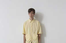
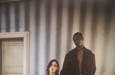
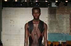
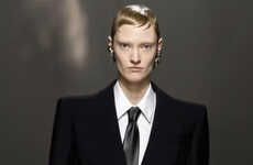
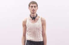
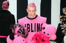
The Jonathan Saunders Autumn/Winter 2013 collection displays an assortment of colors that bleed into one another. The British designer has brought these dripping looks to the fashion fore at the London Collections: Men event, the current site of England's top in-season looks.
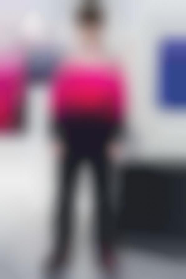
Sensible trousers, outerwear and suit pieces were mixed with this Autumn/Winter 2013's line of vibrant tops. A large chunk of these tops borrowed from popular ombre motifs as chromatic pinks and blues flowed into one another in a cascading manner. The way in which the clothing slightly unraveled points to Saunders' hold over the industry. While this look has the ability to be overwhelming, he has released it with a sense of practicality that is actually quite relaxed.
Sensible trousers, outerwear and suit pieces were mixed with this Autumn/Winter 2013's line of vibrant tops. A large chunk of these tops borrowed from popular ombre motifs as chromatic pinks and blues flowed into one another in a cascading manner. The way in which the clothing slightly unraveled points to Saunders' hold over the industry. While this look has the ability to be overwhelming, he has released it with a sense of practicality that is actually quite relaxed.
Trend Themes
1. Ombre Styles - The trend of combining colors that bleed into each other, offers opportunities to innovate on fabrics and textures
2. Color Blocking - Combining and contrasting splashes of vibrant colors is a style that is gaining popularity, offering opportunities to innovate on designs and patterns
3. Sustainable Fashion - Sustainability can be a disruptive opportunity for innovation in fashion, by using eco-friendly materials and dyes that avoid harmful chemicals and waste
Industry Implications
1. Fashion - Fashion houses can innovate textiles, patterns, and dyes, embracing a more sustainable and colorful direction that appeals to a broad market
2. Interior Design - The bleeding color concept can be applied to interior design and home decor, providing a fresh and lively look that attracts consumers
3. Graphic Design - The color gradient can be translated into graphic design for an immersive user experience that blends colors and shapes seamlessly
4.9
Score
Popularity
Activity
Freshness


