Gail's Bakery Package Design is Minimalist and Sweet
Vittoria Natarelli — June 29, 2010 — Art & Design
References: heredesign & lovelypackage
The package design for Gail's Bakery is a perfect example of what can be done with one color. The packaging looks simple while still being detailed.
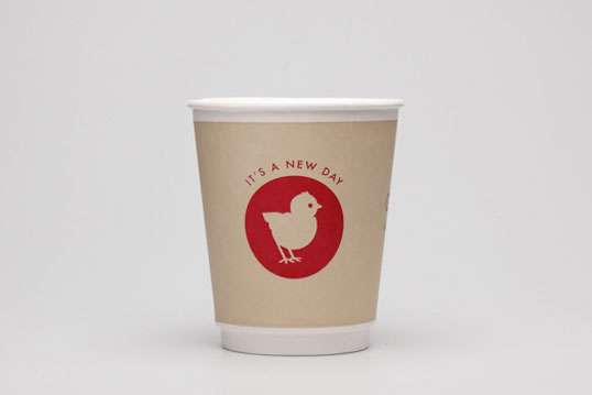
The doily-like pattern on the top of the cake box and the geared cups look beautiful and interesting while maintaining that simplicity and clutter-less look. My favorite from this brand is the little chick with the mantra "It's a new day."
The Gail's Bakery package design breathes positivity and unique branding.
Trend Themes
1. Minimalist Packaging - Exploring the use of one color and simplicity in package design to create an elegant and clutter-less look that stands out.
2. Detail-oriented Packaging - Incorporating intricate patterns and interesting details into package design to enhance visual appeal and attract attention.
3. Positive Branding - Using unique and uplifting branding elements, such as mantras and cheerful characters, to create a positive and memorable brand image.
Industry Implications
1. Food Packaging - Applying minimalist and detail-oriented packaging designs to the food industry, creating visually appealing and attractive packaging for bakery products.
2. Home Decor Packaging - Utilizing minimalist and detail-oriented packaging techniques in the home decor industry, offering elegant and eye-catching packaging for various products.
3. Children's Product Packaging - Implementing positive and unique branding strategies in the children's product industry, creating packaging that appeals to both children and parents while conveying a cheerful and uplifting message.
6.2
Score
Popularity
Activity
Freshness
