The Cotswolds Distillery Gin Has a Darkened and Masculine Look
Jamie Danielle Munro — October 1, 2014 — Lifestyle
References: breeze-creative & packageinspiration
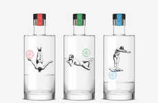
Cotswolds Distillery Gin was recently released with the branding completed by Breeze Creative. The team used a very minimalist yet masculine look for the gin, choosing to use darker coloring with a very clean font.
The logo on the front follows the theme of many modern branding looks these days, making sure that the font is not overly ornate. This way the title of the company is easy to understand for potential buyers, who are not distracted by an excessive amount of graphics. Instead people can be drawn to the minimalist touches and then try the product for themselves.
Breeze Creative stuck with a masculine look for this design, and it will certainly pay off. The entire bottle looks sleek and would be perfect for a power drink to a number of gentlemen.
Trend Themes
1. Minimalist Branding - Opportunity for businesses to create clean and simplistic brand identities that appeal to modern consumers.
2. Dark Color Palettes - Opportunity for industries to explore the use of dark colors in product packaging and branding to create a sophisticated and masculine appeal.
3. Clean Fonts - Opportunity for businesses to utilize clean and legible fonts in their branding to enhance brand recognition and appeal.
Industry Implications
1. Distilleries - Distilleries can leverage minimalist branding and dark color palettes to create a premium and sophisticated image for their products.
2. Beverage Packaging - The beverage packaging industry has an opportunity to explore the use of minimalist designs and clean fonts to create visually appealing and easily recognizable packaging.
3. Alcohol Industry - The alcohol industry can adopt minimalist branding and dark color palettes to target a modern, sophisticated consumer base.
2.5
Score
Popularity
Activity
Freshness

