Cindy Ng Crafts a Sweetly Simple Labels for Killarney Wood's Yummy Spread
Susan Keefe — January 11, 2012 — Lifestyle
References: cindysng & packagingoftheworld
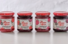
Vancouver-based designer Cindy Ng crafted a simple redesign for preserve producer Killarney Wood's. Killarney Wood's is one of the few remaining local farms based just outside the city of Vancouver. The legendary company has been producing uniquely delicious jams and jellies for the past 100 years. Unfortunately the farm lost much of its land to redevelopment, but its products continue to be a local tradition.
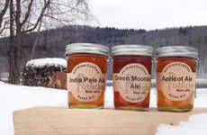
Hoping to capture a larger market without alienating its loyal customer base, Killarney Wood's turned to Cindy Ng to give these historic jams a fresh new look. Cindy Ng selected a clear jar equipped with an effortless and elegant top. A simple label that harkens back to the company's origins announces the flavor of the jam inside. A petite illustration of a worn wheelbarrow that appears above the company name creates a strong association between the product and the earth. Allowing the lush colors of Killarney Wood's preserves to do most of the selling, Cindy Ng has demonstrated clever creative restraint.
Sweet, simple and humble, Killarney Wood's packaging allows these sumptuous jams to sell themselves with their undeniable allure.
Trend Themes
1. Clear Packaging - Using clear jars to showcase product contents and enhance visual appeal.
2. Vintage Design - Incorporating nostalgic elements and retro aesthetics to evoke a sense of tradition and authenticity.
3. Minimalist Labels - Adopting simple and uncluttered label designs that emphasize the product itself.
Industry Implications
1. Food Packaging - Opportunity to enhance product visibility and appeal through innovative packaging designs.
2. Graphic Design - Demand for designers skilled in creating vintage-inspired and minimalist packaging labels.
3. Artisanal Food Production - Chance for local farms and producers to revitalize their brands by updating packaging and tapping into nostalgia.
4.1
Score
Popularity
Activity
Freshness


