The Beth Mathews 'Wes Anderson and His Colors' Chart is Spot On
Diana Duong — June 19, 2012 — Pop Culture
References: bethmathews
Want to decorate your bedroom like The Darjeeling Limited train? Need to incorporate some Royal Tenenbaum color schemes in your wardrobe? Well now, there’s a Wes Anderson film color palette that can help you get some inspiration.
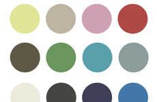
Beth Mathews, a graphic designer from Nashville, was able to pull five main colors from six of Anderson’s films, including the newly released Moonrise Kingdom, onto a palette. It’s impressive how easily one can recognize a film and get a good feel of its mood from simply five colors. Mathews points out on her blog that Anderson has been able to create a brand for himself as a filmmaker with a creative eye.
The colors are consistent throughout his films, appearing anywhere from in the walls and furniture to character’s clothing, poster font or overall color balance.
Trend Themes
1. Film-inspired Color Palettes - Opportunity for artists and interior designers to create unique and immersive experiences by incorporating film-inspired color palettes into their work.
2. Brand Identity Through Colors - Companies can learn from Wes Anderson's consistent use of colors across his films to establish a recognizable and cohesive brand identity.
3. Visual Storytelling Through Color - Content creators can leverage the power of color to convey emotions, set the mood, and enhance the storytelling experience in visual media.
Industry Implications
1. Interior Design - Interior designers can draw inspiration from Wes Anderson's color palettes to create unique and visually captivating spaces.
2. Creative Advertising - Ad agencies can employ film-inspired color schemes to create visually striking and memorable ad campaigns for their clients.
3. Film and Media Production - Filmmakers can explore the use of consistent color palettes to enhance storytelling, create strong visual identities, and evoke specific emotions in their films.
1.9
Score
Popularity
Activity
Freshness


