The 'Rethink' Packaging from Build Follows Minimalist Aesthetics
Francis Tiangson — January 29, 2011 — Marketing
References: core77
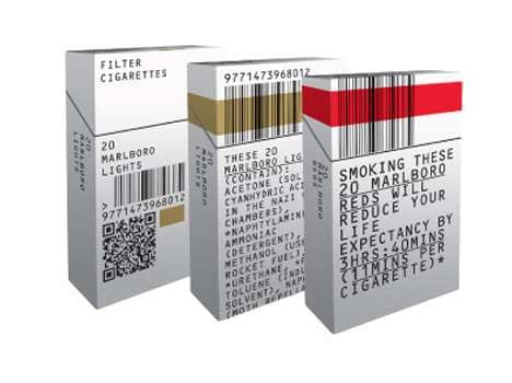
The 'Rethink' Packaging from Build gives cigarette packaging a taste of the debranding craze going on. The London-based graphic design studio literally strips down and rethinks the branding of classic cigarette packs.
'Rethink' Packaging from Build was spurred on as a result of the UK government wanting to sell cigarettes in plain packaging in an attempt to reduce their appeal. The designs are also focused on warning smokers about the possible health hazards of smoking.
'Rethink' Packaging from Build was spurred on as a result of the UK government wanting to sell cigarettes in plain packaging in an attempt to reduce their appeal. The designs are also focused on warning smokers about the possible health hazards of smoking.
Trend Themes
1. Debranding Packaging - The 'Rethink' Packaging from Build is part of the debranding trend, offering an opportunity for businesses to explore minimalist aesthetics and stripped-down branding.
2. Plain Packaging - The UK government's push for plain packaging presents an opportunity for innovative packaging solutions that focus on functionality and health warning communication.
3. Health Hazard Warnings - The emphasis on warning smokers about health hazards opens up potential for creative ways to communicate the risks associated with smoking.
Industry Implications
1. Graphic Design - The 'Rethink' Packaging from Build showcases the power of graphic design in transforming traditional product packaging and generating new visual experiences.
2. Tobacco - The plain packaging trend impacts the tobacco industry, urging companies to adapt their branding strategies and explore different ways to connect with consumers.
3. Packaging Design - The debranding movement and focus on functionality in packaging design sparks disruptive innovation opportunities to rethink how products are presented and communicated.
5
Score
Popularity
Activity
Freshness


