Pauline Detavernier Used European Transit to Create Colorful Alphabets
Alyson Wyers — June 10, 2014 — World
References: behance.net & fastcodesign
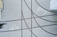
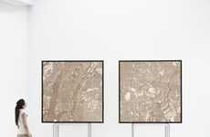
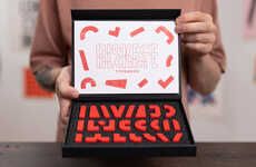
This artsy alphabet designed by 20 year old Pauline Detavernier combines the standard framed map with clever letter typefaces. This typography is made out of subway maps from London, Paris and Moscow, combining two popular design elements.
Each of the featured cities boasts complicated public transit systems, but through the talents of Pauline Detavernier, the subway lines are turned into one of the simplest things a Kindergardener learns -- the ABCs. However, the typography is anything by simple. The colorful lettering not only makes up a Latin alphabet using the London and Parisian maps, but a Cyrillic alphabet using the Moscow subway lines.
The budding artist created the two sets for school, as she is a third year student in architecture school.
Trend Themes
1. Subway Map Typography - Designing typography using subway maps provides an innovative way to merge two popular design elements.
2. Transportation-inspired Typography - Transportation systems could be a source of inspiration for typography design, resulting in unique and creative typefaces.
3. Cultural Typography Fusion - Combining typography and culture through subway maps allows for innovative representations of language and identity.
Industry Implications
1. Graphic Design - This innovative design could be applied by graphic designers to create visually interesting and unique typographic designs for various projects.
2. Urban Planning - Transportation planners could look at this design as a way to make public transit maps more visually appealing and engaging for commuters.
3. Education - Educational institutions could use this approach to teach typography design in a creative and engaging way.
5.2
Score
Popularity
Activity
Freshness


