Paper by Dan Hoopert is Full of Delicate Dimension
Meghan Young — March 21, 2014 — Art & Design
References: behance.net & fubiz.net
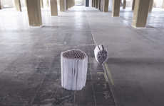
Paper by Dan Hoopert, a 19 year old designer based in the United Kingdom, is a typography series made out of, well, paper. As intricate and creative as his previous three dimensional alphabet, which was crafted out of thin wires, these fonts are perhaps even more so. That is because the paper has been cut to form foliage-like patterns that come together to shape each letter.
A colorful series, Paper by Dan Hoopert displays the visually striking alphabet on green, pink, blue, purple, yellow and red backdrops. This allows the white paper to stand out even more. Whether appreciated online or in the form of a poster, the series will certainly impress many people.
A colorful series, Paper by Dan Hoopert displays the visually striking alphabet on green, pink, blue, purple, yellow and red backdrops. This allows the white paper to stand out even more. Whether appreciated online or in the form of a poster, the series will certainly impress many people.
Trend Themes
1. Intricate Paper Typography - Exploring the potential of intricately cut paper to create stunning typographic designs.
2. 3D Printing and Paper Cutting - Combining advanced fabrication techniques to create even more complex and unique designs.
3. Interactive Paper Sculptures - Using paper cutting and folding to create interactive art pieces that engage the viewer.
Industry Implications
1. Graphic Design - Incorporating intricate paper cutting techniques into graphic design work, especially in branding and advertising.
2. Fine Art - Exploring the use of paper cutting in creating fine art sculptures and installations.
3. Crafts and DIY - Creating DIY projects that use paper cutting techniques to create stunning and unique home decor items.
3.5
Score
Popularity
Activity
Freshness


