Nike and (RED) Create Graphic Body Tears for the Tied Together Campaign
Allison Love — July 4, 2010 — Art & Design
References: marcwyndham & notcot.org
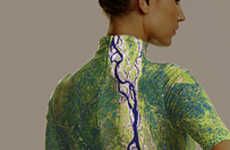
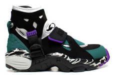
Nike and (RED) have created one crazy art exhibit. The Tied Together Campaign has taken Marc Wyndham Bass's skin distortion art and put the gruesome work on the body, showcasing muscle tissue, arteries, veins and even some bone.
The artwork itself is pretty graphic, looking quite real as the model stands with his muscle tissue hanging out. The Nike and (RED) Tied Together Campaign was commissioned by Kate Moross and Rosie Lee all for Nike. I can imagine this art exhibit will garner a lot of attention, if nothing else.
The artwork itself is pretty graphic, looking quite real as the model stands with his muscle tissue hanging out. The Nike and (RED) Tied Together Campaign was commissioned by Kate Moross and Rosie Lee all for Nike. I can imagine this art exhibit will garner a lot of attention, if nothing else.
Trend Themes
1. Graphic Art - Exploring the use of graphic and disturbing imagery in art to evoke emotions and raise awareness.
2. Body Modification - Pushing the boundaries of artistic expression by incorporating body distortions and anatomical displays.
3. Charitable Collaborations - Partnerships between companies and non-profit organizations to create meaningful campaigns and generate awareness.
Industry Implications
1. Art and Design - Opportunities for artists and designers to push artistic boundaries by creating provocative and thought-provoking works.
2. Fashion and Apparel - Incorporating shocking and impactful visuals into clothing designs to make strong statements and attract attention.
3. Marketing and Advertising - Utilizing controversial and unconventional advertising campaigns to create buzz, engage audiences, and promote social causes.
4.9
Score
Popularity
Activity
Freshness


