Marc Bottler Uses Depth-of-Field to Create Fantastic Fonts
Meghan Young — July 3, 2011 — Art & Design
References: cargocollective & neatorama
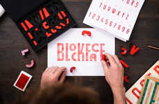
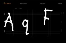
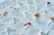
Typography is slowly becoming more and more of an art form on its own rather than a creative extension of a project bigger than itself; just take the work of Marc Bottler as an example. His latest font creation uses optical illusions to make it stand out. Although Marc Bottler's unique typography wouldn't be of much use in some kind of design, its 3-D perception might inspire other fonts to embrace this type of depth-of-field.
Simple yet effective, Marc Bottler's technique involves using what appears to be toy blocks to create letters. One half of these blocks rest flat while the other half stand tall. When shot at the right angle, the result is one uniform letter from the alphabet. Pretty clever, Marc Bottler.
Simple yet effective, Marc Bottler's technique involves using what appears to be toy blocks to create letters. One half of these blocks rest flat while the other half stand tall. When shot at the right angle, the result is one uniform letter from the alphabet. Pretty clever, Marc Bottler.
Trend Themes
1. Artistic Typography - Using typography as an art form allowing more creativity beyond its traditional use.
2. Optical Illusion Design - Incorporating optical illusions into design to create dynamic and eye-catching visuals.
3. Depth-of-field Typography - Exploring 3-D perception to revolutionize typography design and creating new visual experiences.
Industry Implications
1. Graphic Design - Integrating artistic typography in branding and marketing materials to create unique visual identities.
2. Advertising - Using optical illusion design to create innovative and creative ad campaigns that stand out from the competition.
3. Product Design - Incorporating depth-of-field typography in product packaging design to enhance the visual identity of the product and attract consumer attention.
3
Score
Popularity
Activity
Freshness

