Luke Lucas Typography Gets Down and Dirty to Promote Safe Sex
Meghan Young — December 3, 2009 — Naughty
References: lifelounge
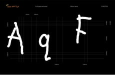
I’ve never been one to write about fonts of any kind because, frankly, I had no interest in them—that is, until this Luke Lucas typography. I may not be the target market for this raunchy creation (I’m not male nor am I cheating on my significant other), but, seriously, who wouldn’t take a second look at this thing?
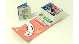
Commissioned by Y&R, the Luke Lucas Typography is for an advertising spot on MTV advocating safer sex. Take a look at the gallery to see all the action.
Commissioned by Y&R, the Luke Lucas Typography is for an advertising spot on MTV advocating safer sex. Take a look at the gallery to see all the action.
Trend Themes
1. Raunchy Advertising - Opportunity to disrupt traditional advertising with provocative content that grabs attention.
2. Typography Innovation - Opportunity to explore unconventional typography to create unique brand identities.
3. Safe Sex Promotion - Opportunity to drive awareness for safe sex practices through creative marketing campaigns.
Industry Implications
1. Advertising - Opportunity to disrupt traditional advertising methods with provocative content that engages consumers and drives conversion.
2. Design - Opportunity to innovate graphic design with unconventional typography approaches that create unique brand experiences.
3. Public Health - Opportunity to drive awareness for safe sex practices and related health issues through creative marketing initiatives.
6.3
Score
Popularity
Activity
Freshness

