Kabinet Brewery Packaging Features a Simple Yet Mesmerizing Illustrated Motif
Amelia Roblin — April 3, 2015 — Marketing
References: markosvircevic & packagingoftheworld
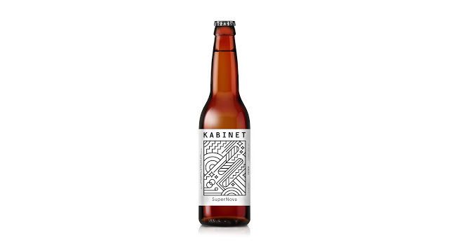
Looking at this line art beer label, you might come to appreciate the potential for visual complexity without the use of colored ink. The white stickers that mark each of the beer bottles are decorated with black strokes only, yet the intricate patterns and the repetitive shapes express the sorts of details that certainly catch the eye.
Marko Svircevic's geometric illustration is consistent with a previous line art beer branding strategy used by Kabinet Brewery. Right angles, perfect curves and consistent contrasting hues make the segments spring from the sticker. The SuperNova variety features the name of the maker in a legible, rectilinear typeface that's just a bit thicker than the labyrinthine arrangement of zigzags, circles, arches, stars and straight lines.
Marko Svircevic's geometric illustration is consistent with a previous line art beer branding strategy used by Kabinet Brewery. Right angles, perfect curves and consistent contrasting hues make the segments spring from the sticker. The SuperNova variety features the name of the maker in a legible, rectilinear typeface that's just a bit thicker than the labyrinthine arrangement of zigzags, circles, arches, stars and straight lines.
Trend Themes
1. Minimalistic Labeling - The trend of using simple line art designs for labels is disrupting traditional labeling techniques, leading to cost-effective and visually appealing packaging options.
2. Black and White Designs - The use of black and white designs is becoming a trend in the packaging industry, providing an opportunity for companies to create sophisticated and impactful packaging without adding extra printing costs.
3. Geometric Patterns - The use of geometric patterns in packaging design is a growing trend that offers a unique and eye-catching alternative to traditional product packaging, creating a opportunity to differentiate from competitors.
Industry Implications
1. Beverage Industry - The beverage industry can take advantage of minimalistic labeling and black and white designs to create a sleek and striking packaging for their products, appealing to younger and modern consumers.
2. Art and Design Industry - The art and design industry can explore the use of line art and geometric designs in packaging, opening up new business opportunities and creative possibilities in the field.
3. Consumer Goods Industry - The consumer goods industry can incorporate the trend of minimalist designs and geometric patterns, providing consumers with visually appealing products that stand out from competitors while also saving costs in packaging design.
3.5
Score
Popularity
Activity
Freshness

