Katerina Orlikova's ‘Light and Typography' is Trippy
Luisa Amanda Gomes — March 2, 2010 — Art & Design
References: behance.net & formatmag
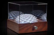
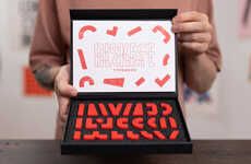
Katerina Orlikova’s ‘Light and Typography’ series is where this artist combines the art of typography with the abstract beauty of the kaleidoscope. Taking the familiar letters of the English alphabet from various typographic sets, Katerina Orlikova uses them to generate a multitude of ever-changing beautiful images.
There are five units of kaleidoscopes which range in fonts from sans serif to calligraphic which get maneuvered into lovely images with just a shake of your hand. So if you get your hands on this 'Light and Typography,' you better get a-shakin'.
There are five units of kaleidoscopes which range in fonts from sans serif to calligraphic which get maneuvered into lovely images with just a shake of your hand. So if you get your hands on this 'Light and Typography,' you better get a-shakin'.
Trend Themes
1. Kaleidoscopic Typography - Opportunity for designers to explore the combination of typography and abstract art through kaleidoscopic effects.
2. Dynamic Typeface Design - Innovative techniques for creating typography that transforms and evolves, leading to visually stunning and ever-changing designs.
3. Interactive Art Experiences - The integration of interactive elements in art installations, allowing viewers to actively participate in the creation of kaleidoscopic visual displays.
Industry Implications
1. Graphic Design - Application of kaleidoscopic typefaces in graphic design can create captivating and unique brand identities for clients.
2. Art Installations - Opportunity for artists and galleries to create immersive experiences through incorporating kaleidoscopic typefaces in installations.
3. Digital Marketing - Utilizing kaleidoscopic typefaces in digital campaigns can capture attention and engage audiences with visually captivating content.
0.8
Score
Popularity
Activity
Freshness


