Greek Extra Virgin Olive Oil Packaging is Simple and Scrupulous
Amelia Roblin — April 4, 2011 — Marketing
References: mousegraphics.gr & thedieline
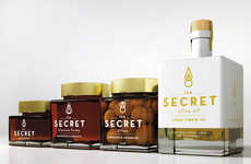
The best product branding gives the consumer an idea of the contents and quality of a commodity, and Greek Extra Virgin Olive Oil packaging offers insight into both.
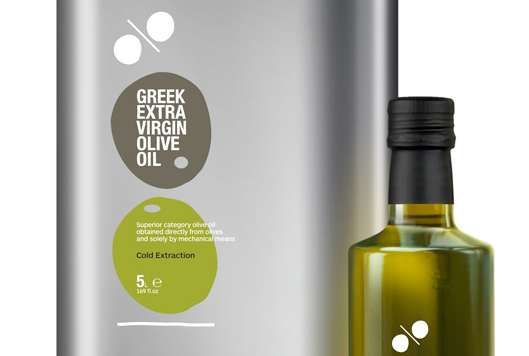
Mouse Graphics is responsible for the brand identity of the cooking oil, settling on a minimalist and marvelous means of labeling both the glass bottle and the tin can. The logo is comprised of a pair of vertically balanced olives, one gray and one green, illustrated in irregular organic ovals with a hint of the pits inside. Arranged in such a way that allows the two to be taken as a couple of zeros, the delicate white percentage sign suggests the liquid's authenticity, as derived 100% from pure Greek bitter fruits. On the whole, Greek Extra Virgin Olive Oil packaging brands the items with informed elegance.
Implications - Branding such as this is straightforward, elegant, efficient and deceptively simple. Consumers appreciate packaging that isn't needless complicated but still communicates the key points that interest them, and this is a great example of how businesses can balance those two concerns.
Trend Themes
1. Minimalist Packaging - Branding that is straightforward and efficient, conveying key points with simplicity and elegance.
2. Informed Elegance - Packaging that communicates key points of interest to consumers with a touch of sophistication and authenticity.
3. Balanced Brand Identity - Brand imagery that cleverly incorporates elements to represent authenticity and quality.
Industry Implications
1. Food and Beverage - Opportunity for food and beverage brands to use minimalistic packaging to effectively communicate product quality and authenticity.
2. Design and Advertising - Need for designers and advertisers to create packaging that balances simplicity, elegance, and key points of interest to captivate consumers.
3. Olive Oil Production - Potential for olive oil producers to enhance their brand identity by incorporating symbolic elements that highlight authenticity and product quality.
2.7
Score
Popularity
Activity
Freshness


