Comic Sans Project Argues for Validity of Underappreciated Font
Jason Soy — December 12, 2011 — Pop Culture
References: comicsansproject.tumblr & blog.thaeger
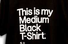
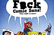
Tumblr's a breeding ground for some of the most bizarre blogs and this Comic Sans Project Tumblr is proof. Sticking up for the little guy that is the Comic Sans typeface, this one-of-a-kind blog injects the font into the world's most popular logos to demonstrate that Comic Sans does indeed have aesthetic appeal, even though it's widely regarded as a joke to industry professionals.
Among the many corporate logos the Comic Sans Project modifies are Walt Disney Pictures, Twitter, Louis Vuitton, McDonald's, Coca Cola and Microsoft. In certain cases, the logo redesigns look even better than their real life counterparts. It just goes to show that, in the right hands, anything can be made to look good.
Among the many corporate logos the Comic Sans Project modifies are Walt Disney Pictures, Twitter, Louis Vuitton, McDonald's, Coca Cola and Microsoft. In certain cases, the logo redesigns look even better than their real life counterparts. It just goes to show that, in the right hands, anything can be made to look good.
Trend Themes
1. Comic Sans Revival - Highlighting the underappreciated beauty of Comic Sans font and bringing it to the forefront of design and branding.
2. Logo Redesigns - Exploring the potential of new and playful approaches to logo design through unconventional font choices and styles.
3. Anti-establishment Design - Challenging traditional design norms and advocating for the value of non-traditional fonts and styles in design.
Industry Implications
1. Advertising & Marketing - Embracing new design trends to help clients stand out in a crowded marketplace.
2. Graphic Design - Encouraging designers to break free from traditional design rules and experiment with new aesthetics.
3. Social Media - Recognizing the potential for social media as a platform to promote new and unconventional design choices and trends.
6.8
Score
Popularity
Activity
Freshness


