The Awesomeness of Stephen Hawking Infographic Reviews His Life
Rebecca Byers — April 10, 2012 — Tech
References: onlinephd.org & holykaw.alltop
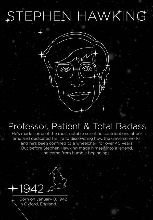
OnlinePhD.com's the Awesomeness of Stephen Hawking infographic is a clever visualization of the history behind one of the most notable scientists of our time. The infographic, which is made to appear as a sky map, is subtitled 'Professor, Patient & Total Badass,' in an attempt to make light of Stephen Hawking's notable contributions to the modern understanding of the universe.
Beginning with his birth in Oxford, England in January of 1942, this informative graph is filled with interesting trivia, such as the fact that he had earned his PhD by the age of 23. Most amazingly, Hawkings was given only two to three years to live in 1962 due to a debilitating disease, but has clearly succeeded in making the most of it.
Beginning with his birth in Oxford, England in January of 1942, this informative graph is filled with interesting trivia, such as the fact that he had earned his PhD by the age of 23. Most amazingly, Hawkings was given only two to three years to live in 1962 due to a debilitating disease, but has clearly succeeded in making the most of it.
Trend Themes
1. Infographic Visualization - The Awesomeness of Stephen Hawking infographic highlights the potential of using visualizations to convey complex information in an engaging way.
2. Biographical Infographics - The rise of biographical infographics presents an opportunity to celebrate the achievements and contributions of notable individuals in a visually appealing manner.
3. Science Communication - The Awesomeness of Stephen Hawking infographic exemplifies the growing trend of communicating complex scientific concepts in a more accessible and entertaining way.
Industry Implications
1. Data Visualization - The field of data visualization can incorporate the use of infographics to present information in a more visually compelling way.
2. Education and Publishing - The education and publishing industry can leverage biographical infographics to engage and educate audiences about historical figures and their contributions.
3. Science and Technology Communication - The science and technology communication sector can explore creative ways, such as infographics, to make scientific information more relatable and engaging to wider audiences.
1.7
Score
Popularity
Activity
Freshness

