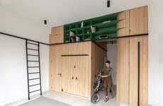
Natalie Hodgins has designed this incredibly small kitchen. Even with space restriction a major issue, Hodgins managed to create a kitchen that feels open but still has a lot of color.
The kitchen is definitely minimalist, with only three colors used: orange, gray and white. The orange brightens up the white walls and the gray cabinets make it look as if the entire kitchen was painted that color. Natalie Hodgins' wonderful eye for design has made this kitchen a sunny and inviting place to be, regardless of size.
Sunny Minimalist Kitchens
This Room Designed by Natalie Hodgins is Small But Sweet
Trend Themes
1. Small Space Design - The design of this small kitchen showcases the potential for creating functional and visually appealing spaces in limited areas.
2. Minimalist Aesthetics - The use of a limited color palette and clean lines in this kitchen exemplifies the minimalist design trend, which focuses on simplicity and visual decluttering.
3. Colorful Accents - The strategic use of a vibrant orange color as an accent in this kitchen demonstrates the trend of incorporating bold and eye-catching elements into minimalist designs.
Industry Implications
1. Interior Design - The minimalist and small space design trends presented in this kitchen provide opportunities for interior designers to create innovative and efficient solutions for compact living spaces.
2. Kitchen Appliances - The emphasis on functionality and space optimization in this kitchen design suggests opportunities for kitchen appliance manufacturers to develop compact and multi-purpose products suitable for small kitchens.
3. Home Improvement - The concept of transforming small kitchens into visually appealing and practical spaces creates a market for home improvement companies to offer specialized services and products tailored to small kitchen design.


