Murray Kimber's Illustrations Incorporate Color and Depth
Annie Ho — July 5, 2010 — Art & Design
References: behance.net
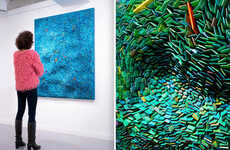
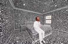
Who knew that 2D could look 3D with a few simple coloring techniques? Murray Kimber uses these techniques in his artwork to create more depth. His designs and portraits feature everything from daily family life to a business man dressed up as the rabbit from 'Alice in Wonderland.'
You can check out more works from Murray Kimber via the source links, but for now make sure you look through the illustrations featured in this gallery. With sketchy colors that remind one of Vincent Van Gogh, Kimber's art will surely amaze you.
You can check out more works from Murray Kimber via the source links, but for now make sure you look through the illustrations featured in this gallery. With sketchy colors that remind one of Vincent Van Gogh, Kimber's art will surely amaze you.
Trend Themes
1. 3d-like Drawings - Kimber's coloring techniques bring a sense of depth to 2D artwork.
2. Sketchy Colors - Kimber's use of colors adds a unique and captivating element to his artwork.
3. Everyday Scenes - Kimber's illustrations showcase the beauty in daily life, providing an opportunity for brands to highlight their products in a relatable and authentic way.
Industry Implications
1. Art and Design - Kimber's artwork and coloring techniques could be applied across the art and design industry to add significant value and creativity.
2. Advertising and Marketing - Kimber's illustrations could be used in advertising and marketing campaigns to promote products and brands in a more authentic and relatable way.
3. Publishing - Kimber's illustrations could be incorporated into a range of publications, such as children's books, to add a unique and creative touch.
3.1
Score
Popularity
Activity
Freshness


