Jil Sander Shows Designs Against Shadows
References: jilsander & fashiongonerogue
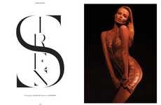
The new Jil Sander ads are nothing if not stark. Shying away from the usually opulent world of high fashion, the Jil Sander ads show models Natasha Poly and Artur Daniyarov against a shadowy black background.
The Jil Sander’s ads pop the color of the dress in a fun way, all the while leaving the models in a silhouetted look that is both fashionably stark and seriously cool.
Take a look at the new Jil Sander’s ads above.
The Jil Sander’s ads pop the color of the dress in a fun way, all the while leaving the models in a silhouetted look that is both fashionably stark and seriously cool.
Take a look at the new Jil Sander’s ads above.
Trend Themes
1. Stark Silhouette Ads - Using stark silhouettes in ads to create a fashionably cool and monochromatic look.
2. Pop of Color - Highlighting a vibrant color in an otherwise monochromatic advertisement to create visual impact.
3. Shadows as Design Element - Incorporating shadows as a strategic design element to add depth and drama to ads.
Industry Implications
1. Fashion and Apparel - Leveraging the stark silhouette advertising approach to create visually striking fashion campaigns.
2. Advertising and Marketing - Exploring innovative ways to use shadows and silhouettes in ads for various brands and products.
3. Photography and Visual Arts - Experimenting with the use of shadows and light to create unique and visually captivating images.
3.8
Score
Popularity
Activity
Freshness


