Ghislaine Vinas Designed Barrows' New Office Interior
Joey Haar — October 12, 2016 — Art & Design
References: gvinteriors & design-milk
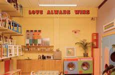
If an office is drab, it can have a real and measurable effect on worker output, and Ghislaine Vinas' design for the South African advertising agency Barrows takes that fact into account. The design puts color at the forefront, coordinating the various common spaces throughout the interior with chromatically synchronized palettes.
It would be potentially damaging to the productivity of an office to splash color throughout an interior with abandon, as incongruous hues can end up giving people headaches. However, Ghislaine Vinas' design chooses to keep the spaces within the same color palettes.
When colors do combine throughout Barrows' space, they are carefully selected to work well with one another. For instance, the green and blue areas converge, but those two colors blend, easing the transition between spaces for the workers passing through.
Trend Themes
1. Chromatic Synchronized Palettes - Opportunity for businesses to incorporate color-coordinated design elements throughout their offices, potentially boosting worker productivity and aesthetic appeal.
2. Carefully Selected Color Combinations - Potential for businesses to strategically choose color combinations that work well together, creating a harmonious and visually pleasing environment for employees.
3. Colorful Office Design - Opportunity for businesses to embrace vibrant and visually stimulating office designs, which can positively impact the overall mood and creativity of employees.
Industry Implications
1. Interior Design - Disruptive innovation opportunity for interior design firms to offer services focused on color-coordinated office designs, expanding their market potential and differentiation.
2. Advertising Agencies - Opportunity for advertising agencies to enhance their office interiors using chromatic synchronization, creating a unique and inspiring work environment for their creative teams.
3. Workspace Optimization - Potential for companies specializing in workspace optimization solutions to incorporate color coordination strategies, promoting improved employee productivity and well-being.
4
Score
Popularity
Activity
Freshness


